Reno Business Park Branding & Signage
Branding Portfolio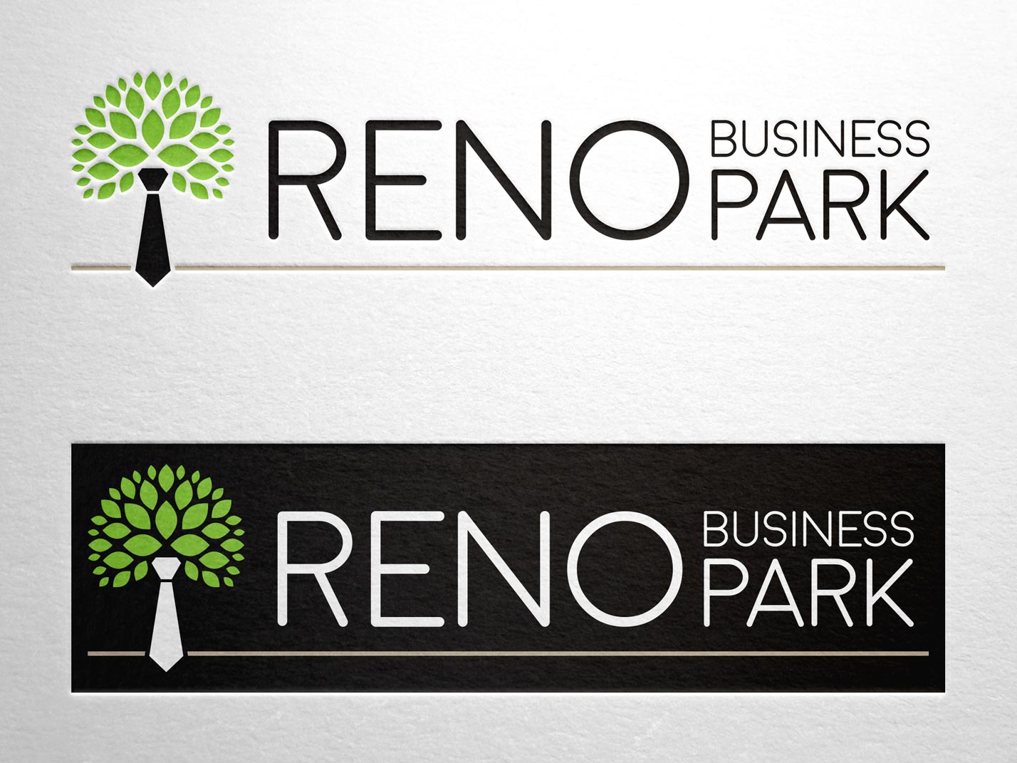
Date
June 16, 2016
Category
Branding, Logo Design, SignageAbout This Project
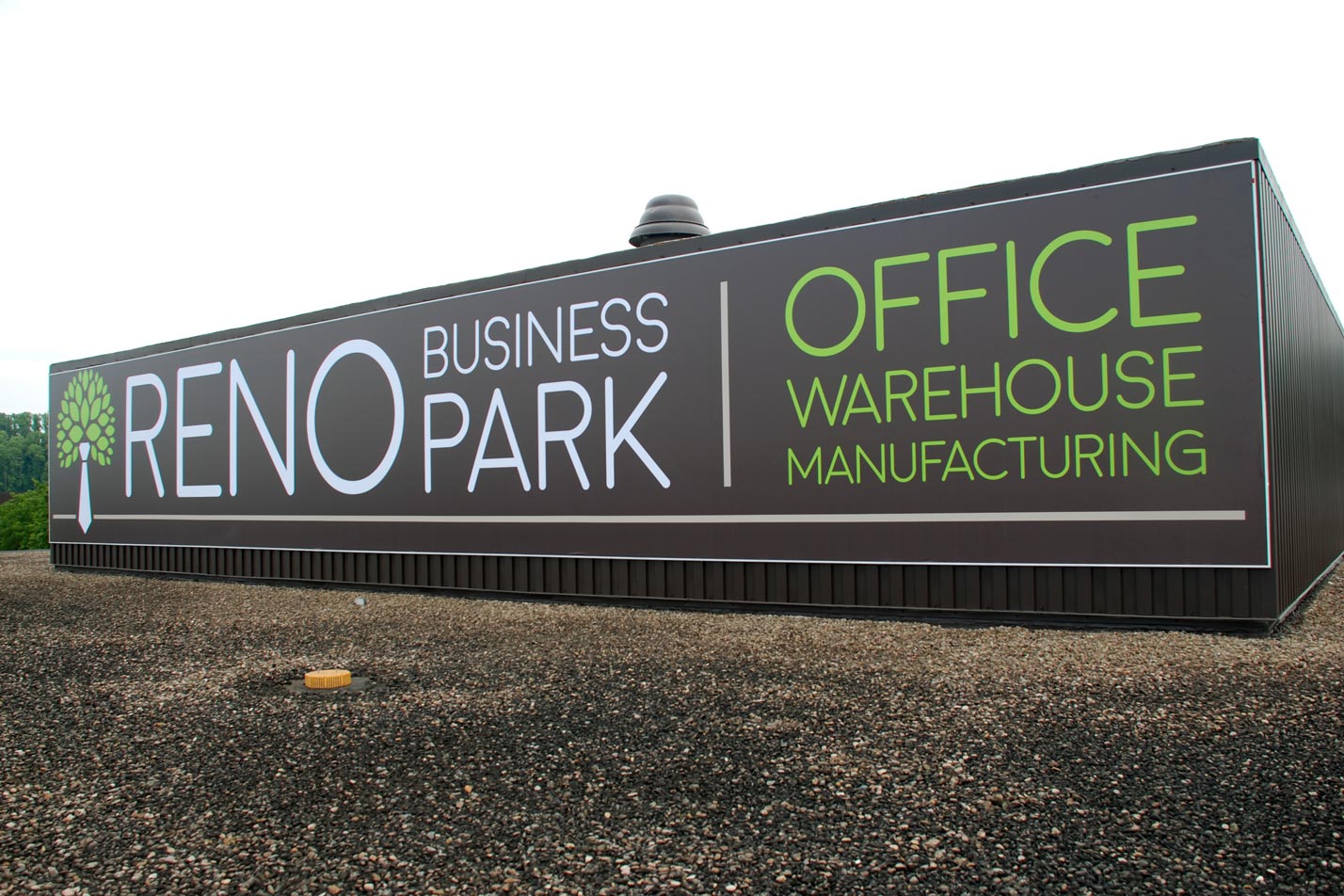
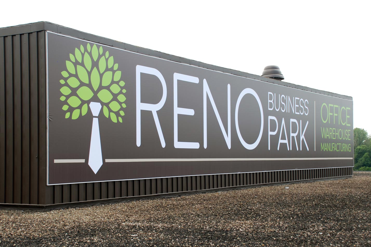
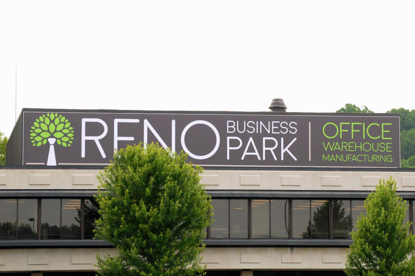
Reno Business Park is a large industrial and office complex located just on the outskirts of Marietta, Ohio. The building is extremely large and noticeable from the road. Still, most travelers did not understand what the complex was used for and that there was space for lease for various uses. The property management company wanted to create an identity for Reno Business Park that would catch commuter’s attention and provide clarification that the property was a business campus. I used a play on words to create a logo that incorporates a tie to represent “Business” and a tree to represent the “Park”. The management company wanted to continue with the modern architecture feel, so the logo has clean lines and a vivid green used in conjunction with a deep brown and clean stark white. The sans serif font continued the modern feel.
Once the logo was finalized, we created an 82′ x 15′ (yes, that’s feet) sign to erect on the most noticeable tower on the property. We used a massive tension banner system to assure the signage was secure and appropriately mounted for both safety and aesthetics. Designed while working for Clayman & Associates in Marietta, Ohio.